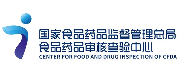
In order to carry forward the construction of the national food and drug inspection and improve the overall image, the Center for Food and Drug Inspection of CFDA (CFDI) has redesigned the logo, which will be launched on January 1, 2018.
The new logo takes "i", the initial letter of "inspection" as the main design concept and combines modern and international design elements, embodying the responsibilities of CFDI to undertake food and drug inspection and representing the future of the change and development of CFDI, apart from displaying a modern and energetic characteristic. The implication of the new logo are as follows:
1. The new logo is the transformation of "J" and "C", two initial letters of Chinese pinyin "Jian Cha" (inspection), and also the combination of the English letter "i" and the Chinese character "Ren" (people). CFDI protects the public health through inspection and safeguard the food and drug safety, highlighting the predestined responsibility of CFDI.
2. The letter "I" shares the meaning of "Wo" (I, the first-person singular nominative case) in English, the same pronunciation as Chinese character "Ai" (love), and "I" is the initial letter of Inspection, the combination of which represents the meaning of "love the enterprise of food and drug inspection"; the letter "I" and word "eye" shares the same pronunciation, indicating that the inspector wants to have the discerning eye of finding problems, embodying the meaning of "looking into the potentials risks with eyes, bowing oneself to serve the sentient beings".
3. The outline of new logo is similar to " 讠 ", a radical in Chinese characters which means "honor one’s words and avoiding talking nonsense" during the food and drug inspection, and all the work shall be performed in a rational and proper manner (which means playing by the rules) ; meanwhile, it also represents that the inspection agencies and the units to be inspected shall have a good communication with each other to realize the common goal.
4. The new logo resembles "a man is spreading his wings and flying", which not only means that the inspectors are always prepared for the protection of drug safety, but also implies that the beginning of enterprise of drug inspection and its change in our country has arrived.
5. The color of the new logo is purple blue, reflecting the work of CFDI is scientific, normative and authoritative. Blue represents water, which is a symbol of fairness and justice; blue is also the color of sky, signifying vision and future.
Here is a kind reminder: when the new logo is officially launched on January 1, 2018, the website of CFDI and the Official Accounts "The Window to CFDI" will also change the homepage design and QR code.
We would like to express our thanks to all of you for your long time concern and support. CFDI will focus on the overall situation of the review and approval reform, strictly follow the theme of reform and innovation development, keep together and devoted to scrupulously fulfill our duties in the construction of inspection mechanism and system, the construction of the inspector team as well as inspection standard system to show the public a brand new image of food and drug inspection.